Proper Logo Usage Guidelines
Our logo is a key part of our brand identity. To maintain consistency and professionalism across all promotional materials, it is essential that our logo is used correctly. Below are the guidelines for how our logo can and cannot be used.
Approved Logo Usage
Use only the official logo provided.
Maintain the original proportions—do not stretch, distort, or resize disproportionately.
Use only the approved brand colors (listed below).
Ensure clear spacing around the logo—do not place it too close to text or other elements.
Only use the logo on a solid background that maintains visibility and contrast.
Unacceptable Logo Alterations
Do not change the color of the logo.
Do not add drop shadows, gradients, or other effects.
Do not stretch, skew, or distort the logo.
Do not crop or modify any part of the logo.
Do not rotate, flip, or tilt the logo.
Do not place the logo on busy or low-contrast backgrounds that make it hard to read.
Do not add any additional elements inside, over, or around the logo.
Brand Colors
Please use only these official colors in promotional materials.
Red: #CC0410
Light Red: #F6CECE
Black: #141414
White: #FFFFFF
Fonts
Marcellus: Use for heading text
Europa: Use for paragraph text
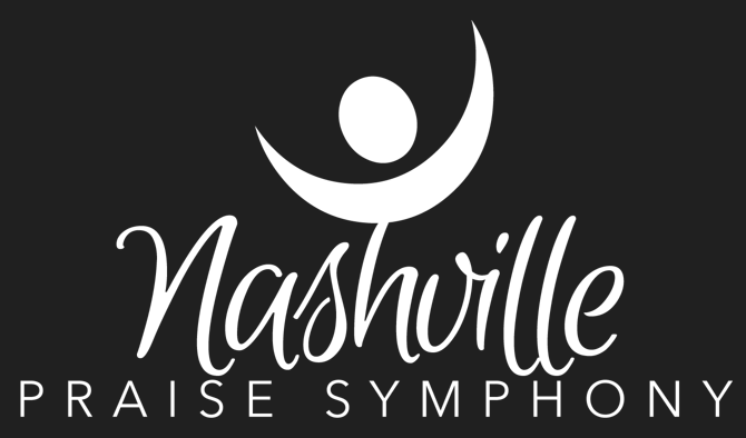
Approved Logos
All of the logos below have a transparent background. Only the logos provided are approved for use. Do not use logos found on Facebook or other online sources. By downloading the logo, you agree to follow the guidelines outlined above.
WHEN TO USE:
Use with a light background
WHEN TO USE:
Use with a dark background
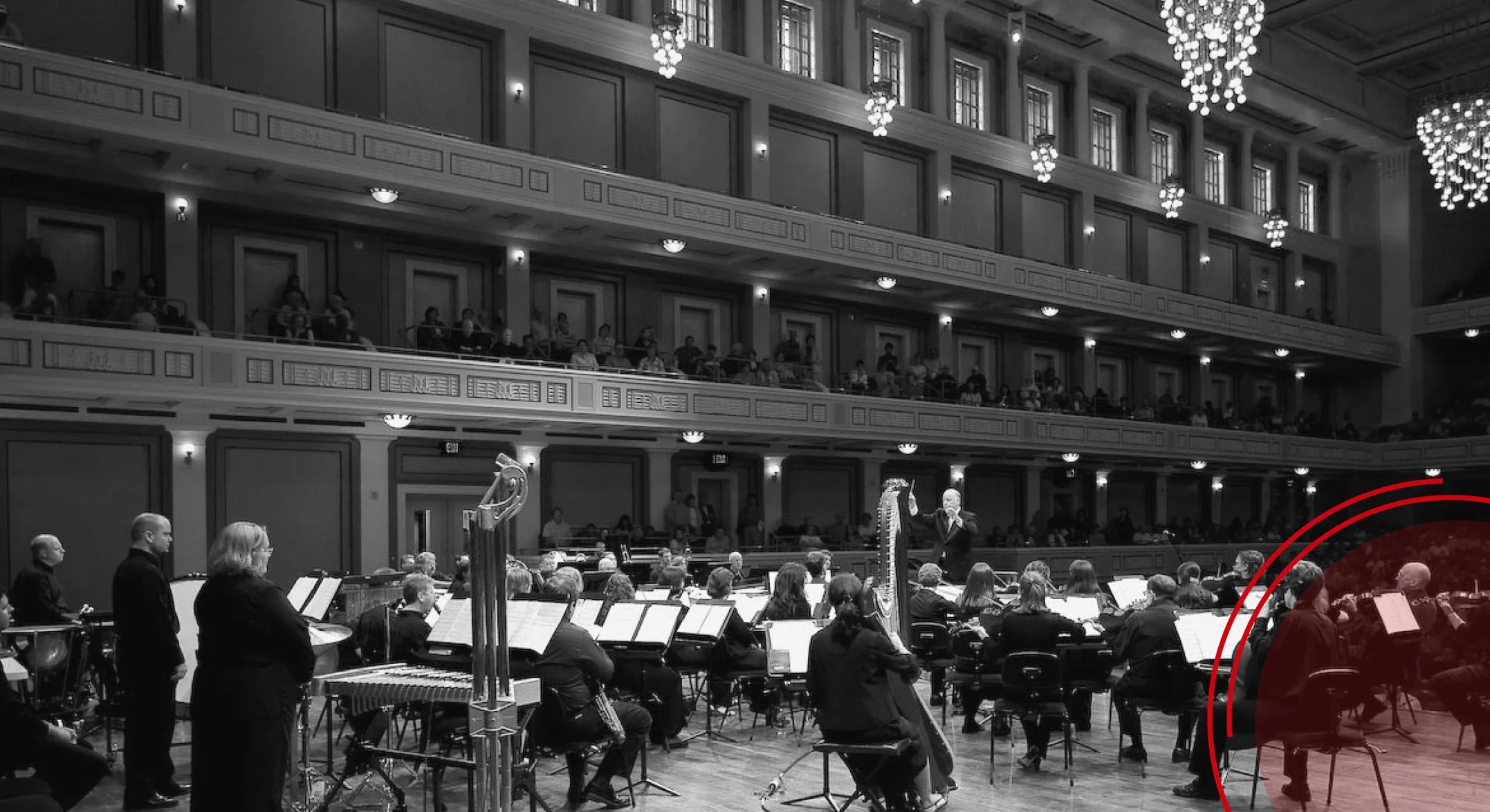
Approved Photos
These photos may be used in the promotion of Nashville Praise Symphony.


If you need additional information or have questions about how to use our logo, please contact us. Thank you for helping us maintain our brand integrity.